Swivit Sweets

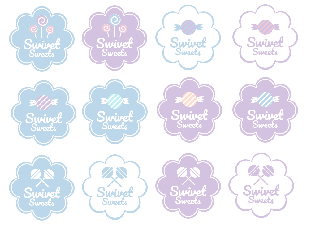
I was hired to create a candy shop for imported snacks and candies. The client wanted a logo in a semi pastel colour and from there we agreed upon some stuff through a moodboard. After creating some mockup designs and colour scheme variations.
Moodboard

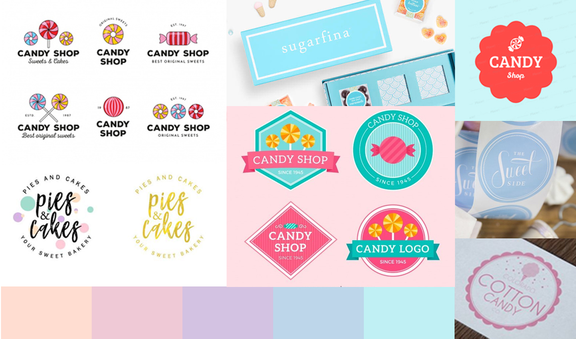
Starting off with the soft pastel colours, I showed off a few designs from other candy companies, some fonts and logo ideas. The client ended up liking more of the candy icons and the shape border style visuals.

Used: Adobe Illustrator

Logo Variations & Creation

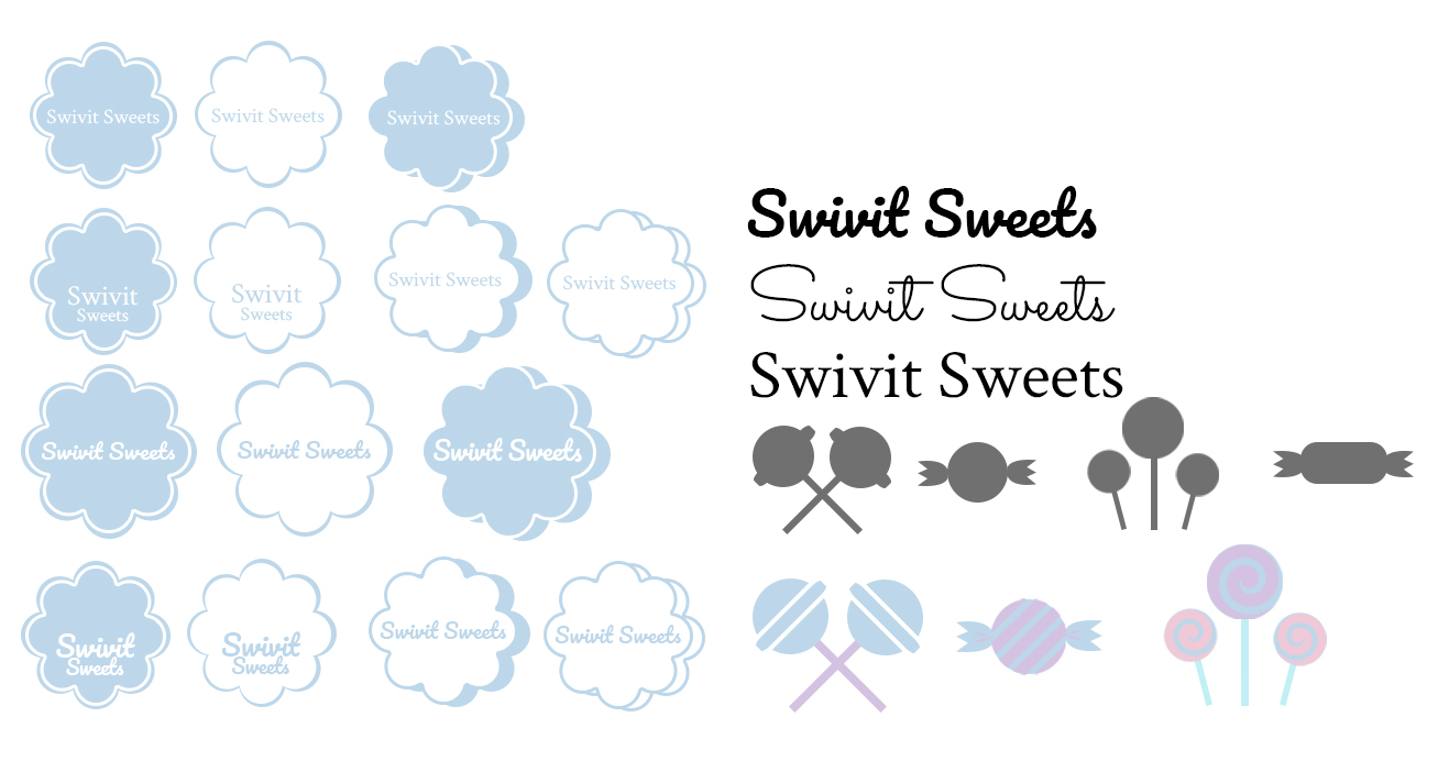
Starting off with these templates I played around with the text, locations and started building some shapes for candies.

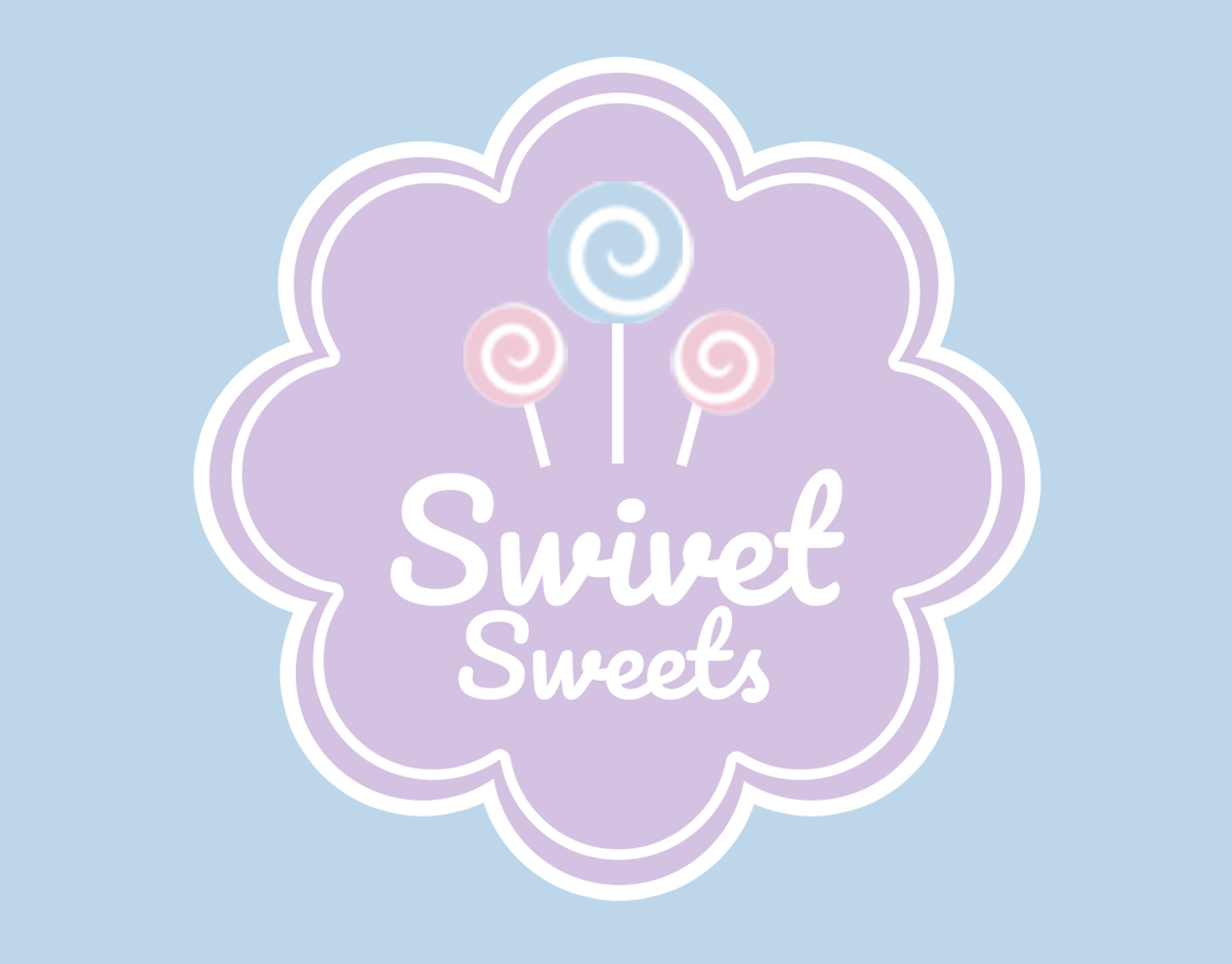
After some confirmation from the client, I ended up making some variations of the colour, candy and ended up with the final design.

Resolute

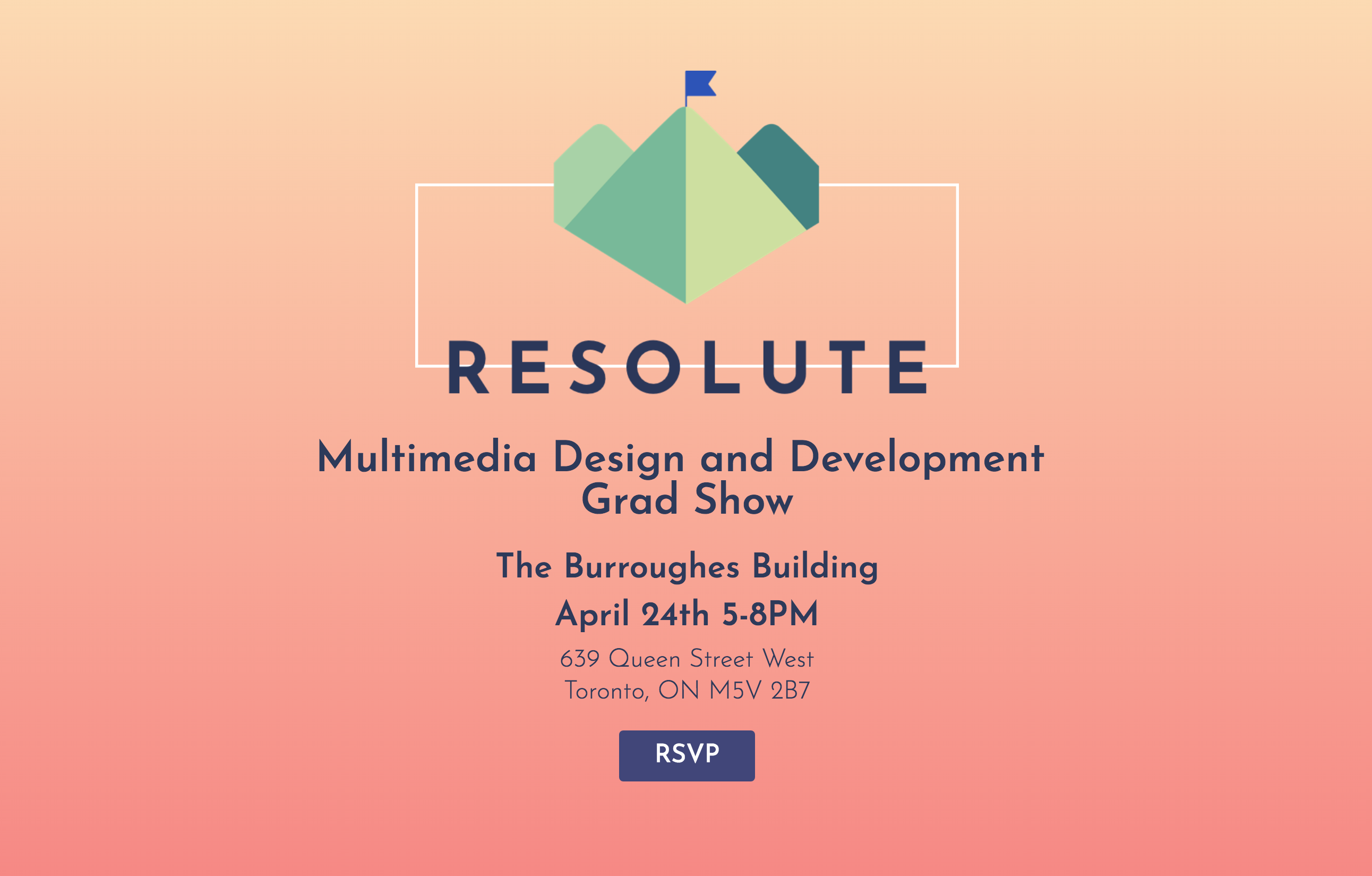
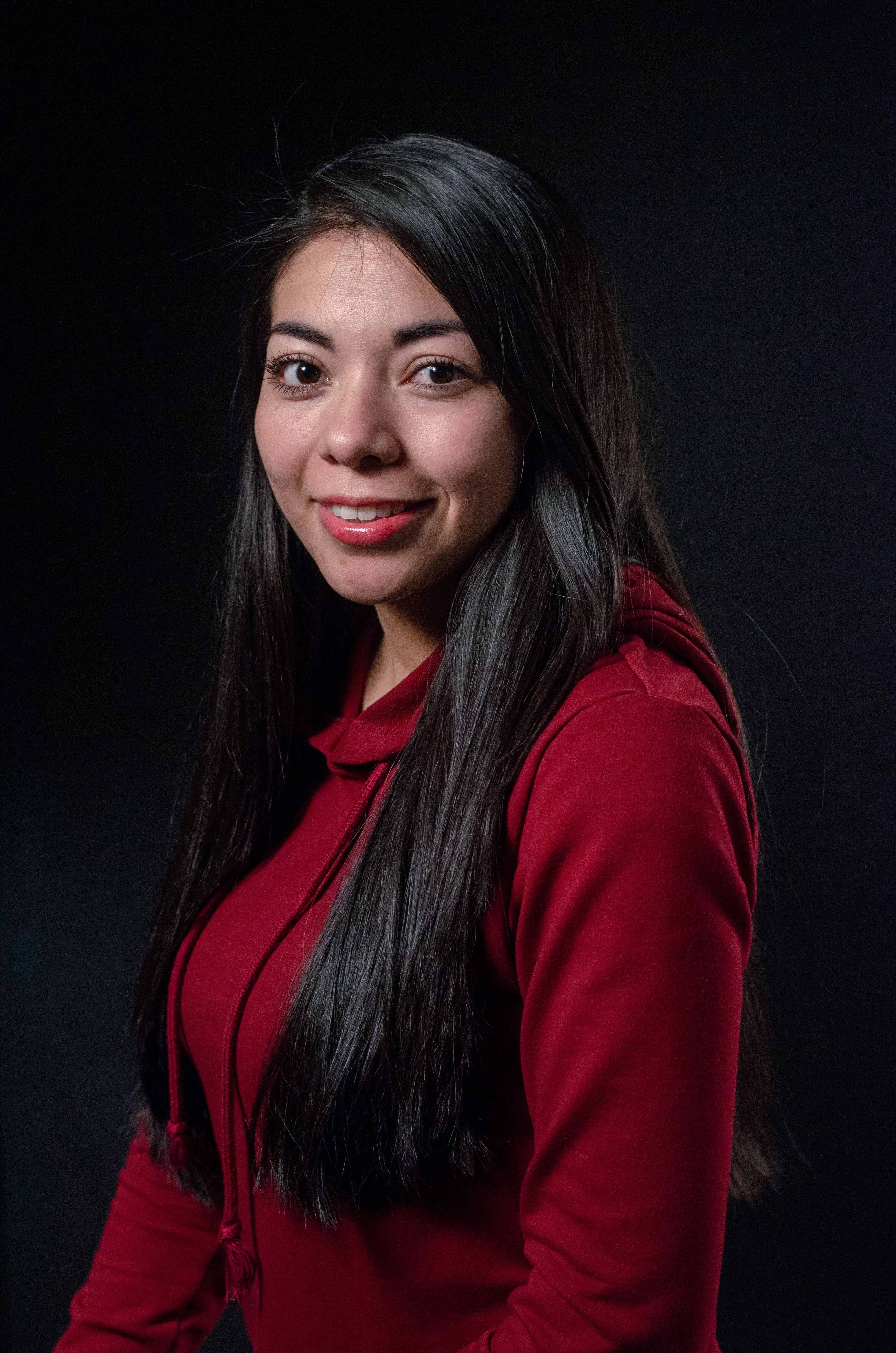
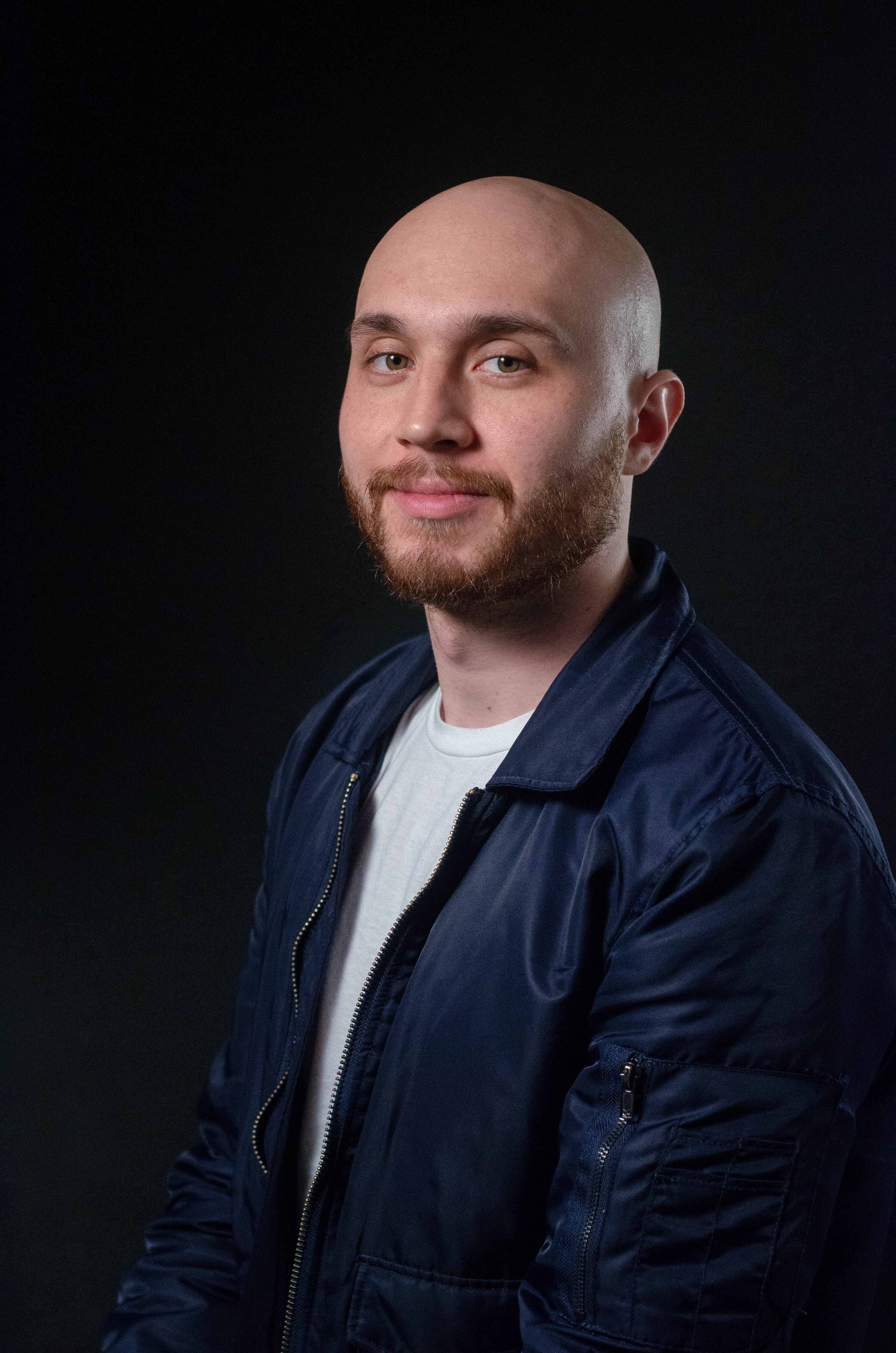
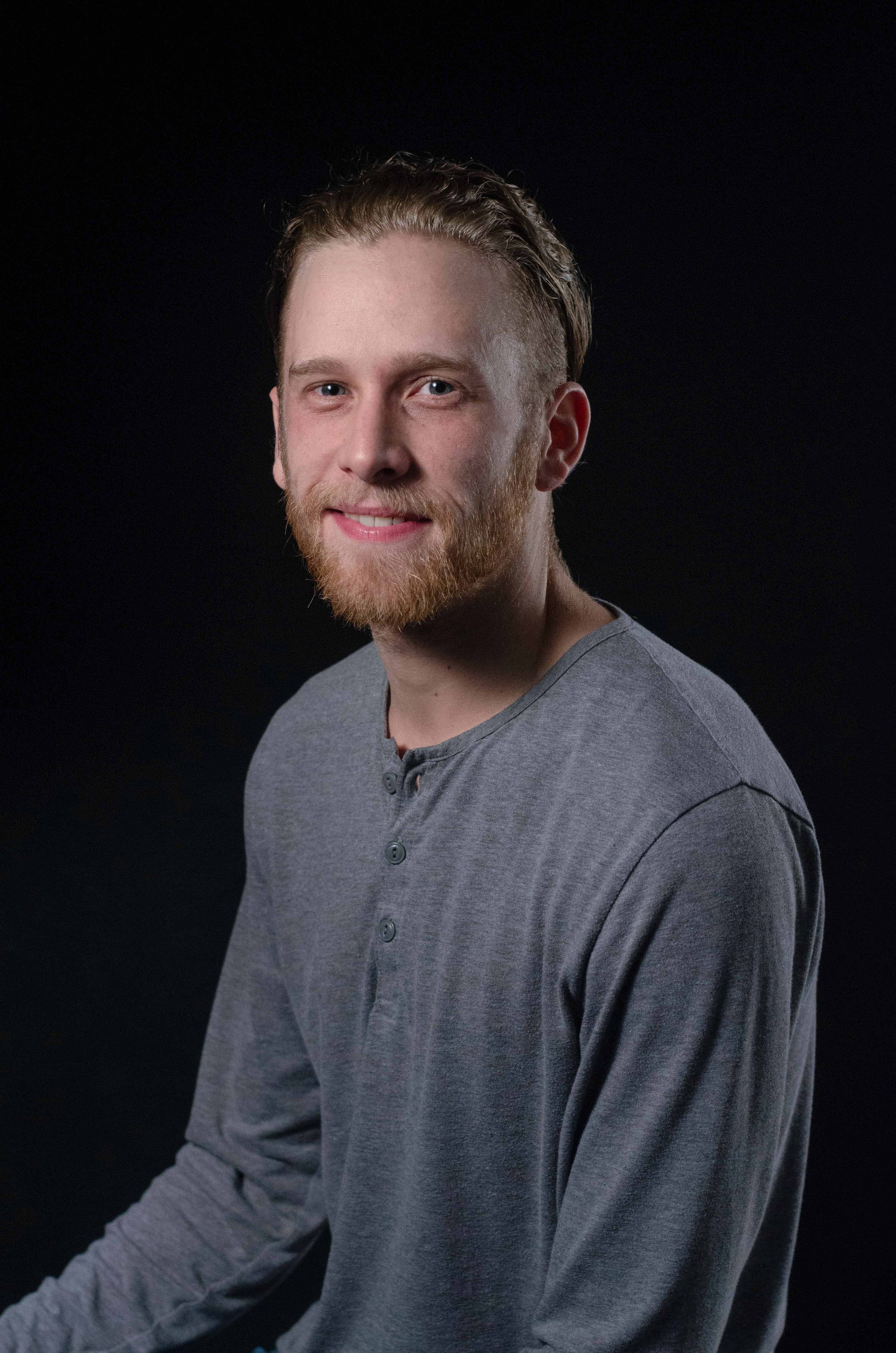
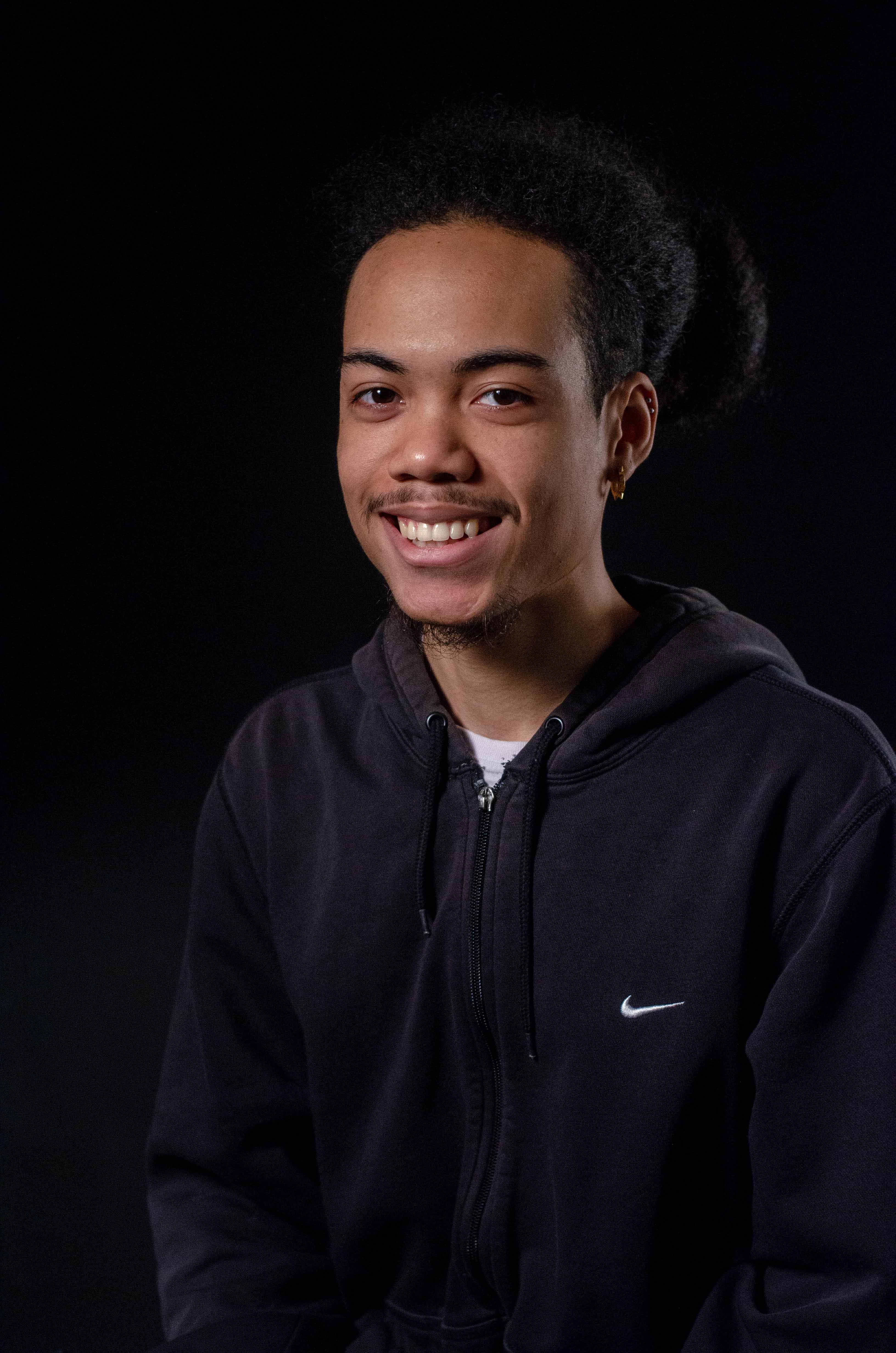
For our graduation at Humber College 2018, Multimedia Design and Development, we need to create a site to advertise our graduation show. We ended up creating a website, advertised through social media and Eventbrite. I was mainly on the side of logo creation and took portraits of the graduates.

Logo Creation

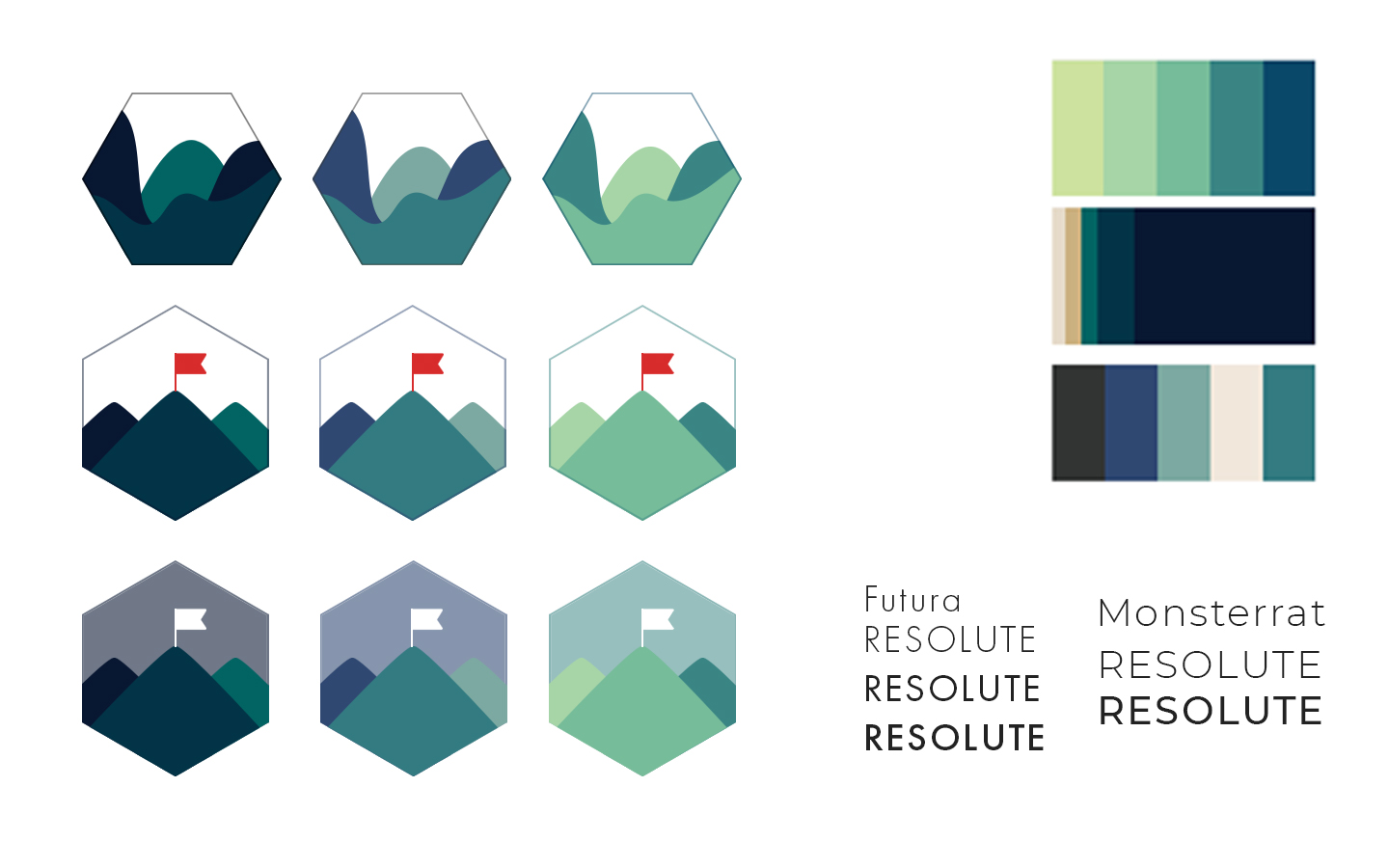
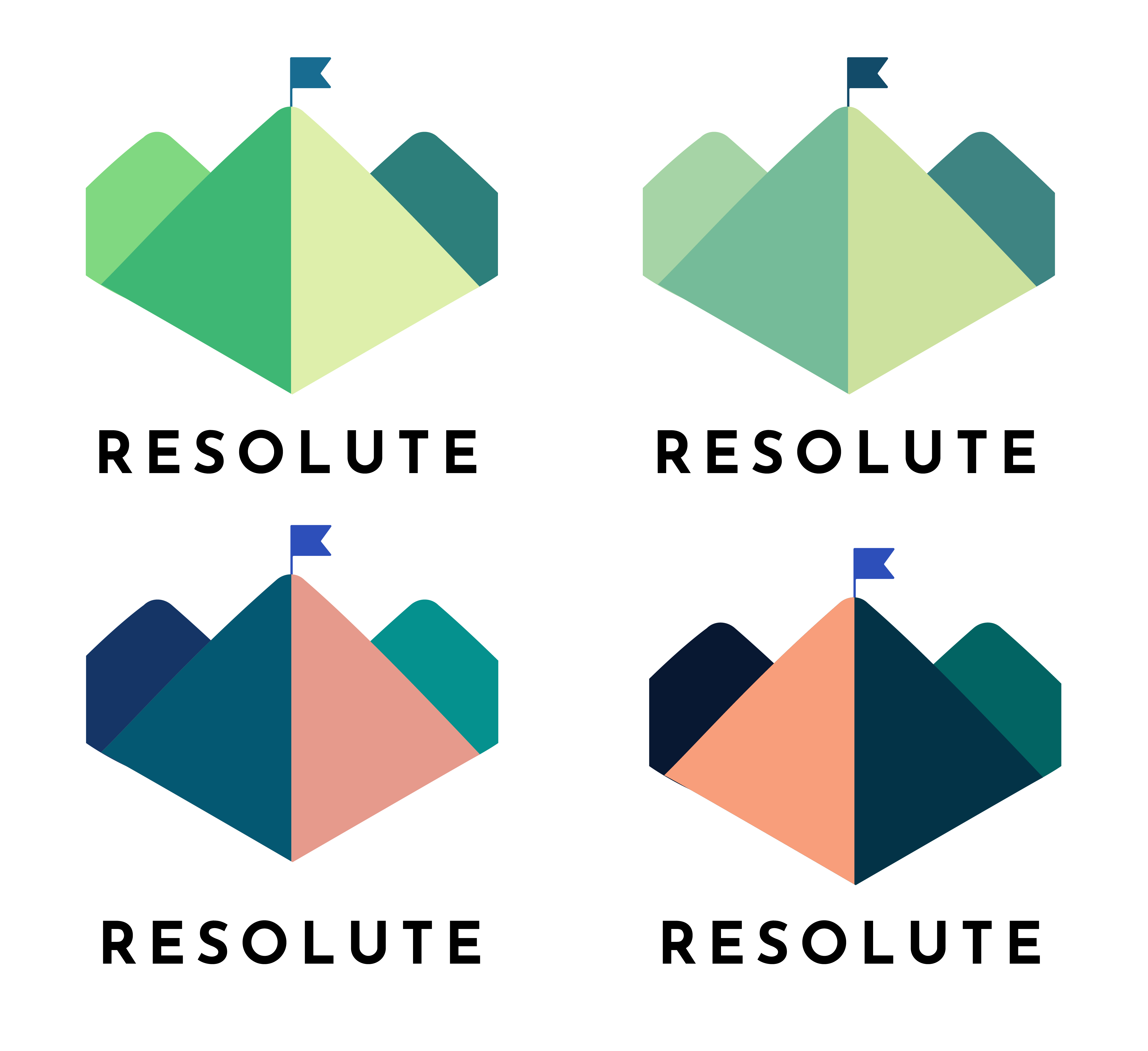
After the first variation, we finalized some ideas and ended up with a second pass of the logos.

RESOLUTE V1

Starting off with a name we had to decide what to name theme of the graduation show, we had ideas of Catalyst, Apex, Asterisk and many more, eventually we ended up with the name Resolute meaning "admirably purposeful, determined, and unwavering."

After the first variation, we finalized some ideas and ended up with a second pass of the logos.

Final Logo

Finally, we decided on what would fit best and the final version of the logo.

Completed with Julia Raynham

Website & Advertising

While the website was being created by another team composed of Jay Lee, Yuko Higuchi, Julia Raynham & Jeremy Boyd and the advertising and social media team Shannon Halycz & Carlos Junior Veloso.

Final Website

Used: Adobe Illustrator for logo design, Lightroom & Photoshop for photography

Photography

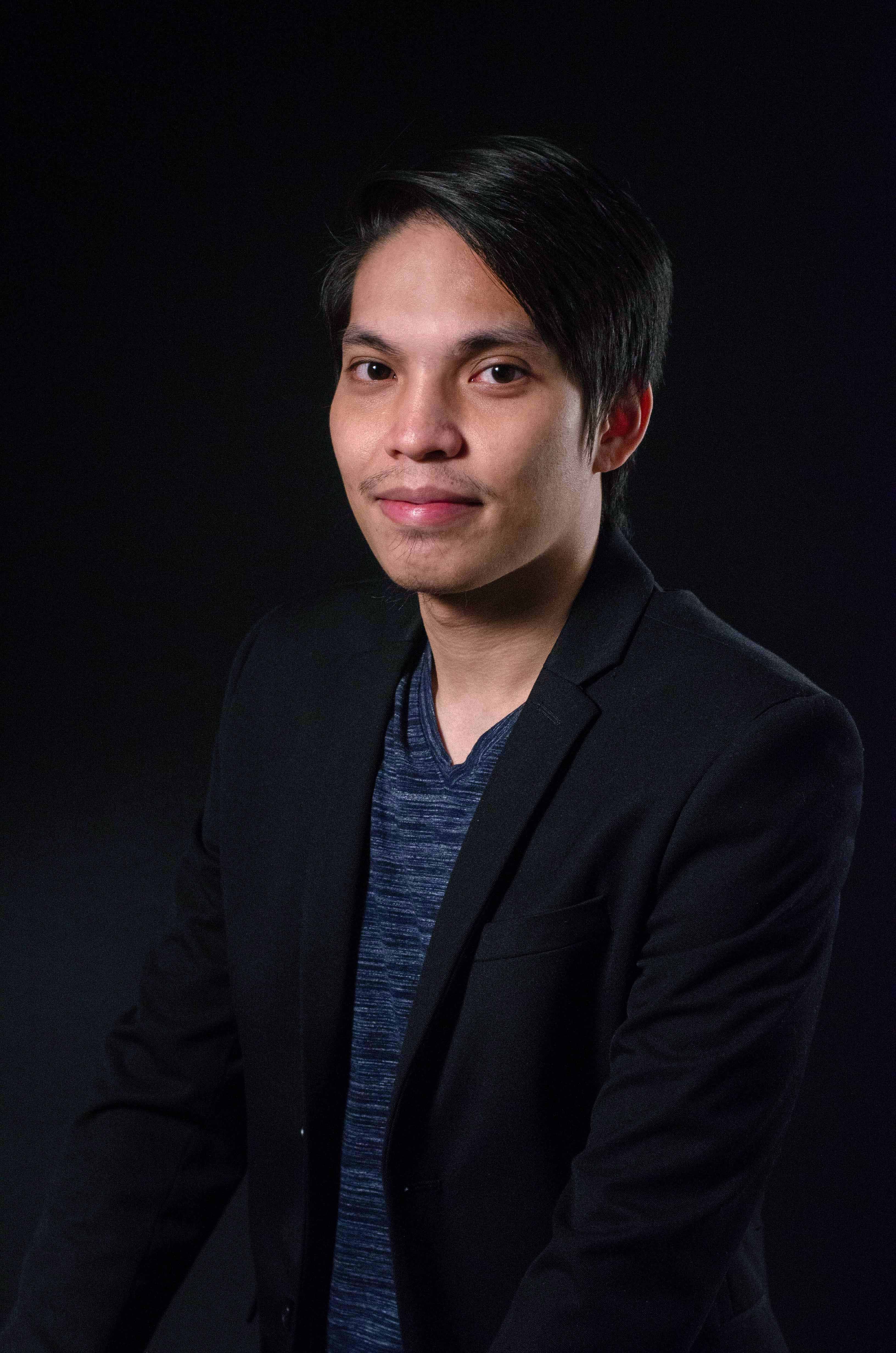
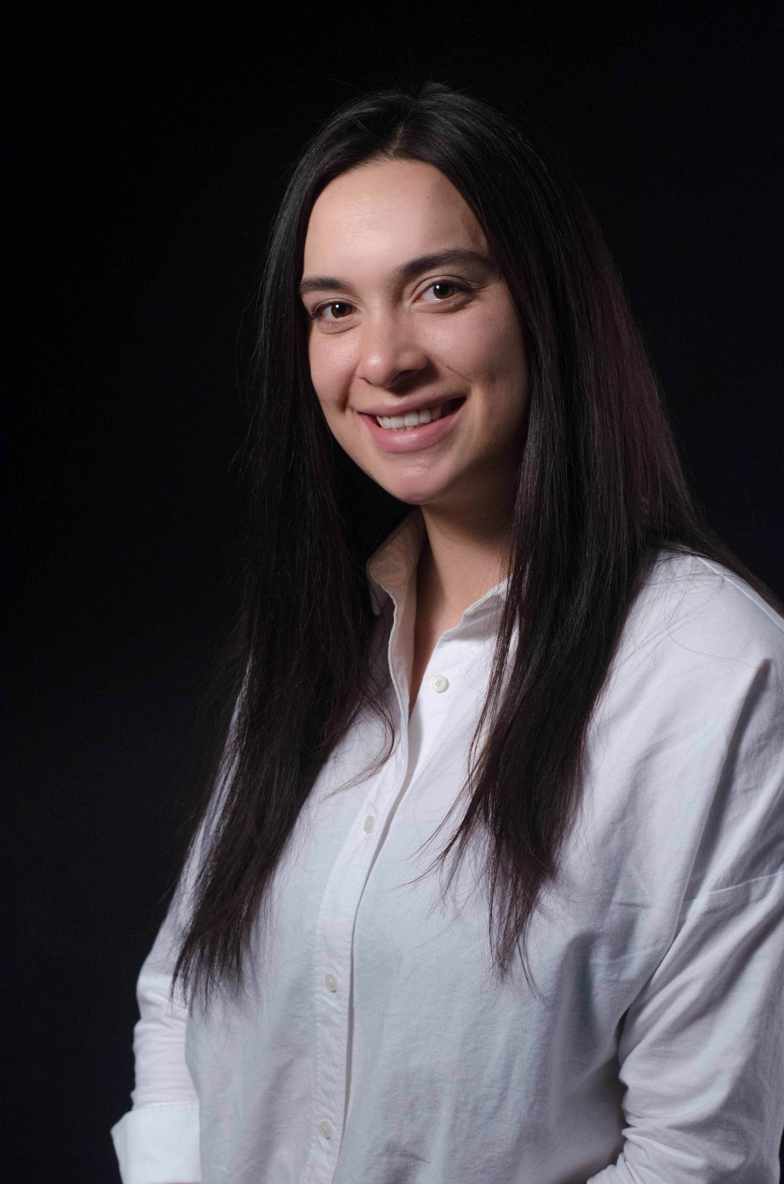
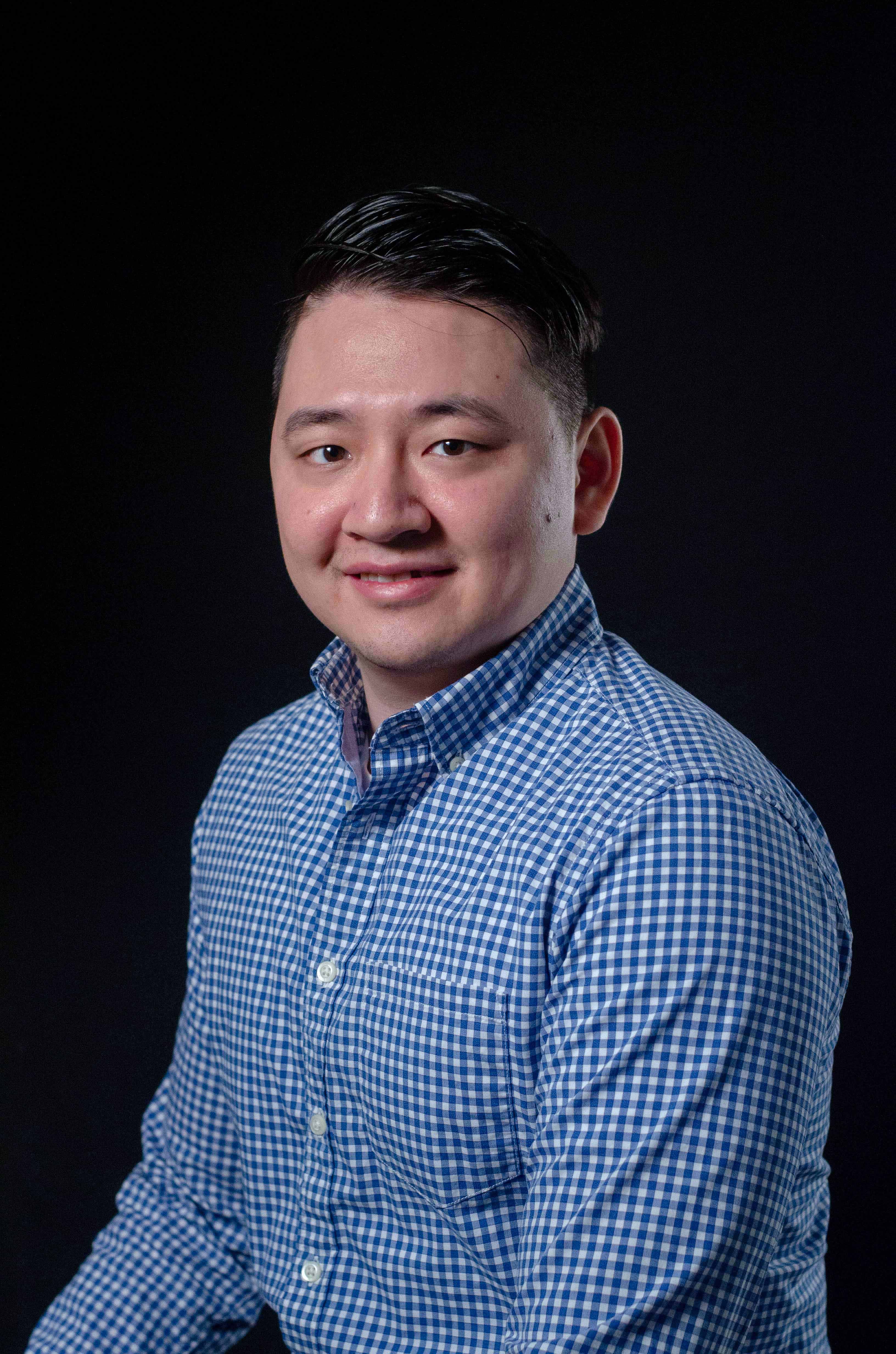
A few examples of the photographs that were taken and edited.

Co-Photographer: Alistair Impelido

Clover Nail Spa

The purpose of this project was to brand a spa for a client. The client had the name Happy Clover Spa in mind in a newly constructed building in a busy residential and commercial area. The client wanted a design that was clean, simple but also reflects an easy-going spa.

Project Summary & Logo Design

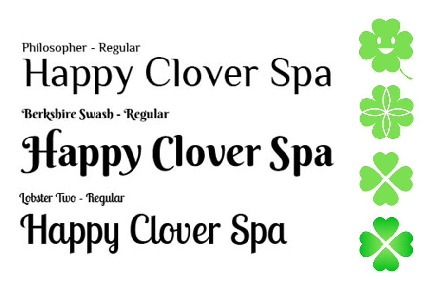
Taking a few basic designs I had finalized a few clovers for the design. However the client ended up choosing the most basic one as it was a very simple and clear cut. I had liked the heart motif on the clovers and wanted to have more of a minimalistic visual allowing the hearts to be what makes up the clover.

I had a talk with the client and they wanted a more decorative font that looked more friendly and less formal. These were some of the designs I had chosen. The client ended up choosing the second font. This gives the shop a lot more of a friendly casual feel.

Final Logo

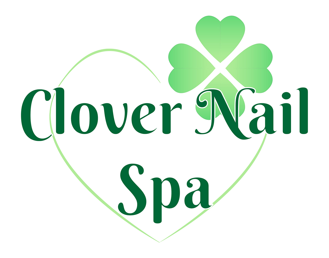
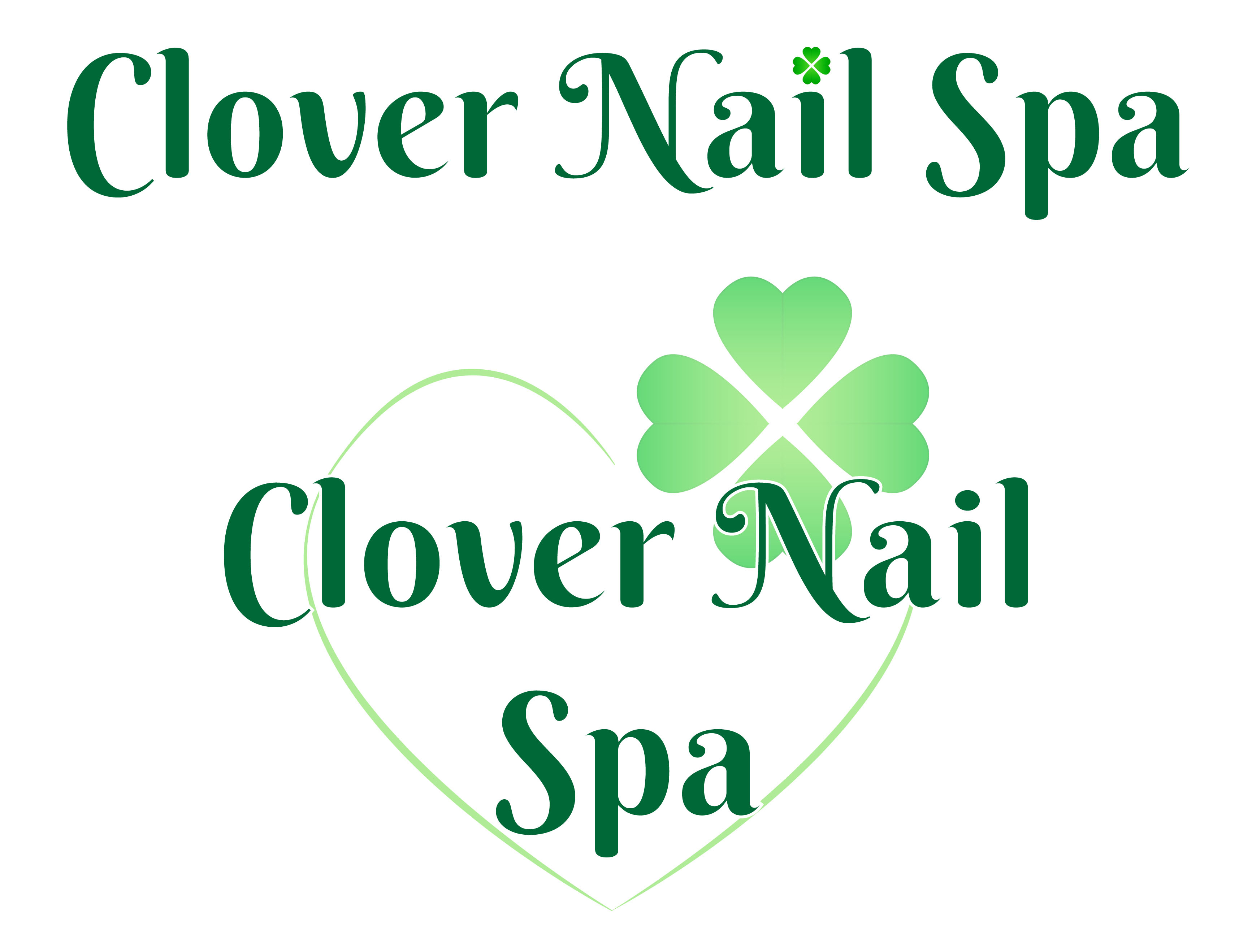
The client had a small name change and went with Clover Nail Spa instead of Happy Clover Spa. Knowing this I had to change the design a little and this was the end product. I went for a more simple and easy to read design. It was a little hard putting green on green, I later realized that the words would blend in the clover, with more of the newer designs, the clover has a lighter colour allowing the text to be differentiated.

Used: Adobe Illustrator & Photoshop

Business Cards & Flyers

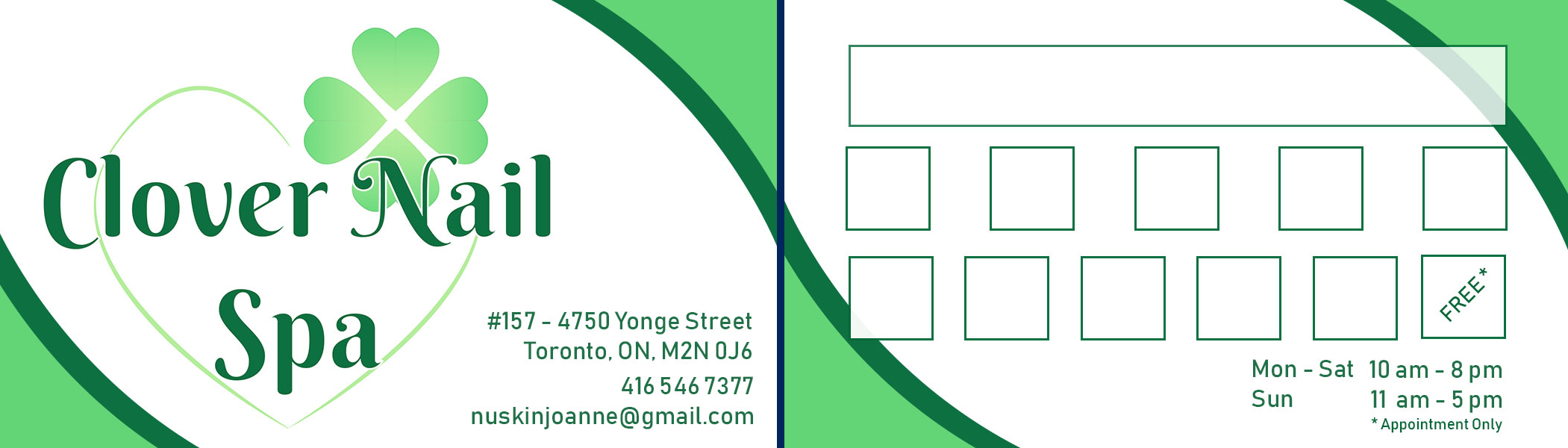
Taking a very simple visual where it's clear cut and to the point, the design I went for the business card allows for the client to have spaces to write different promotional advertising and allow for changes in the future. I had created another version that just had their Instagram and WeChat information instead in case they didn’t want the version with the boxes.

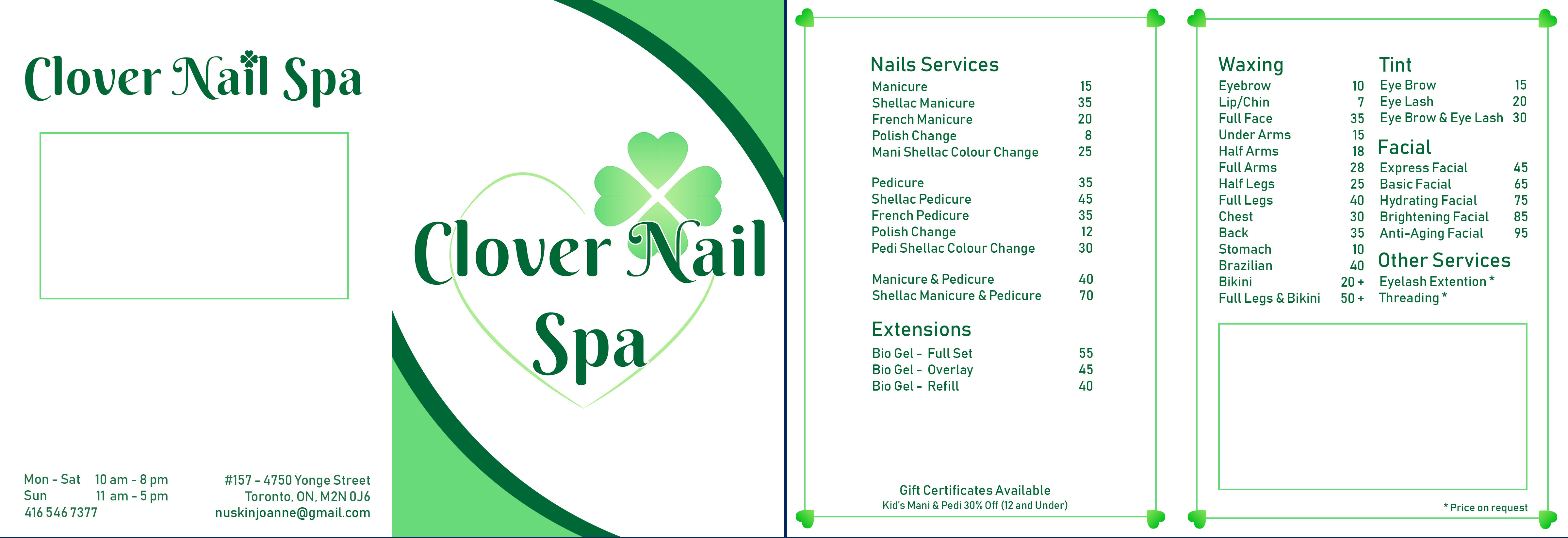
The flyers were designed similar to the business card, simple while still giving the information needed. Taking the heart idea, I made a border around it to give off a more visually interesting look.